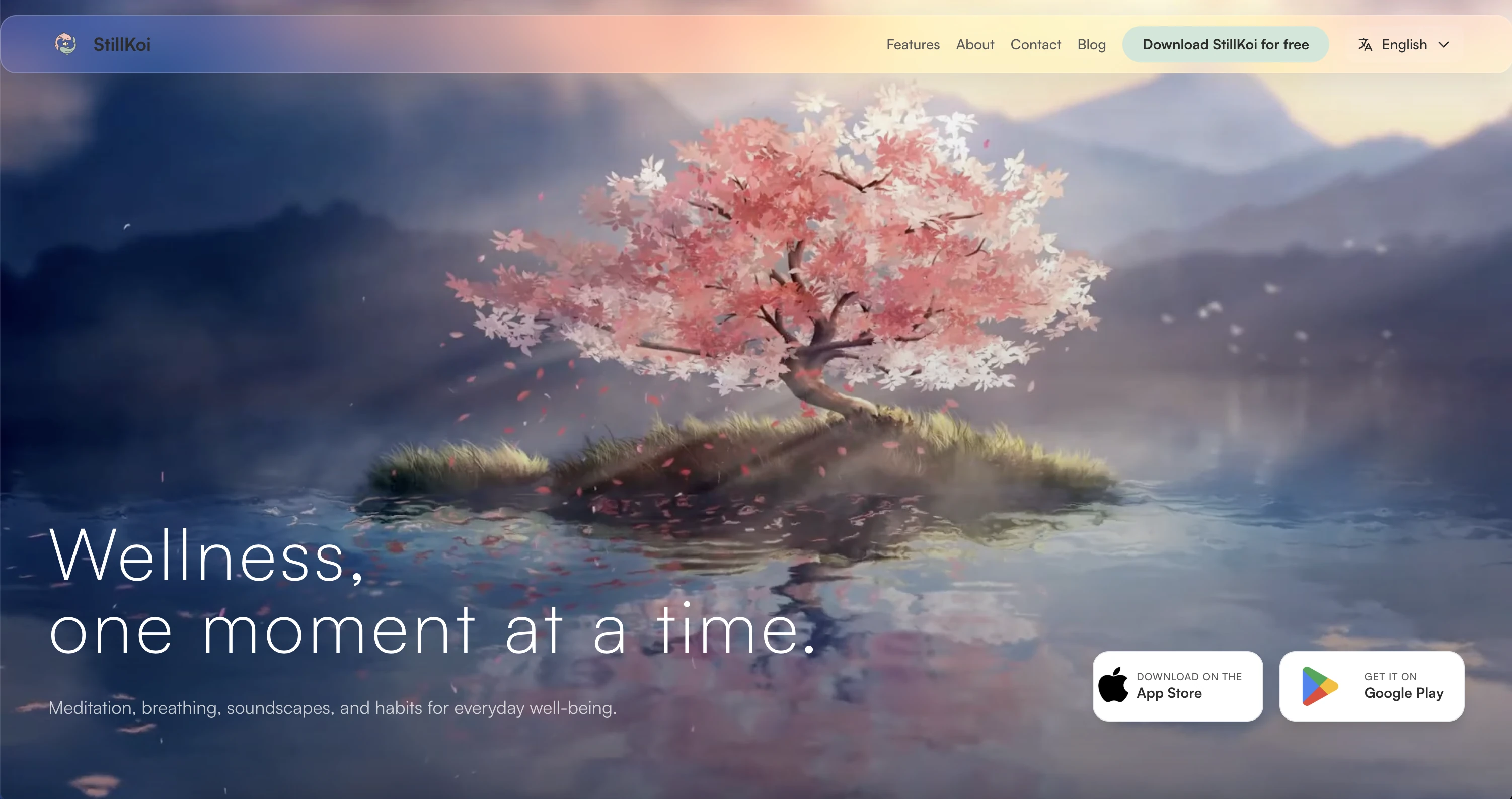
Open five wellness apps and you will likely see the same app five times.
Soft gradient. Rounded card. A breathing animation that feels borrowed from a stock motion library. The category settled on a house style years ago, and most products in it are content to wear it.
StillKoi was built to avoid that house style entirely.
A Category That Looks Like One App
Digital wellness is one of the most visually saturated spaces in software. Meditation, breathing, and mindfulness apps tend to converge on the same handful of choices, and the result is a category where most products are interchangeable.
Strip the logo from most wellness apps and a user would struggle to tell them apart. The patterns repeat:
- soft gradients used as a substitute for an actual color system
- onboarding flows copied from the same three templates
- typography treated as an afterthought instead of a mood
- a mobile app and a marketing website that barely look related
None of this is wrong, exactly. It is just generic. StillKoi needed to feel like one considered product — not a calming theme applied on top of a feature list.
The Brief Was a Product, Not a Page
StillKoi was scoped as a full digital product ecosystem from day one: brand identity, a marketing website, and a mobile app, all launching as one system rather than three separate efforts handed to three separate teams.
That scope changes how the work gets approached. A brand built only for a website can lean on motion and big imagery. A brand built only for an app has to survive a 6-inch screen and a thumb. StillKoi's identity had to do both at once, which meant every early decision — color, type, spacing — was tested against a phone screen before it was ever approved for a hero section.
Calm Is a Decision, Not a Default
The instinct in this category is to reach for softness and call it calm. We treated calm as something that has to be engineered, not assumed.
That meant starting with structure before mood: clear hierarchy, deliberate spacing, and a grid that held together under pressure. That groundwork rarely gets noticed, but it is the reason a soft interface doesn't end up feeling flimsy.
Only once that structure existed did the softer decisions get layered on top — rounded forms, gentle motion, a restrained palette.
"The koi is two opposing forces, moving in harmony. That single idea ended up governing almost every screen we designed."
One Visual Language, Two Platforms
Most products in this space treat the website and the app as separate projects shaped by separate instincts. StillKoi's brand, website, and mobile interface were built as one system from the start, anchored by a few non-negotiable rules:
- a single color logic — pastel tones with enough controlled contrast to stay legible
- rounded UI elements set inside a structured, grid-based layout
- generous, breathable spacing instead of dense, feature-packed screens
- calm, restrained typography that never competes with the content
- soft transitions used as connective tissue between screens, not decoration
Open the website, then open the app, and nothing should feel like a hand-off. It reads as one product with two entry points, not two products that happen to share a name.
Designing the Screens People Actually Return To
A guided breathing exercise, a sound mixer for winding down at night, a simple way to track a daily ritual — these are the screens people open every day, not the onboarding flow they see once and forget.
Each one followed the same rule: reduce friction without losing personality. A breathing screen does not need seven options on it. A sound mixer does not need a manual. The interface had to step back so the experience could come forward — which, in practice, took more design effort than a busier screen would have, not less.
Designing Against Our Own Instincts
torsn's own visual identity runs dark, high-contrast, and deliberately intense. StillKoi asked for the opposite register entirely: light, soft, and quiet.
That contrast turned out to be useful. It proved the underlying design system is not one house style stretched across every brief — it's a discipline that can hold a mood as quiet as StillKoi or as loud as a brand built to command attention, without losing structure either way.
What Shipped
StillKoi launched as a complete, cross-platform product: a unified brand identity, a marketing website, and a mobile app live on iOS and Android, all speaking the same visual language.
That kind of outcome rarely shows up as a single number. It shows up as a product that feels like one decision, made consistently, across every surface a user happens to touch.
What This Means If You're Building a Wellness Product
Most of what made StillKoi work is not specific to wellness apps. It applies to any product trying to stand out in a category that has already agreed on a look.
- Build the structure first. Soft and calm only holds together on top of a strong grid.
- Pick one symbol or idea and let it govern every design decision, not just the logo.
- Treat your website and your app as one product. Users notice the seams when you don't.
- Design the screens people actually return to with more care than the ones they see once.
- Resist the category's default aesthetic on purpose. Interchangeable is the most expensive thing a product can be.
Because in a market full of products that all look like the same app, the one that feels considered — structurally, not just visually — is the one people stay with.